 Support Board
Theme Installation
The theme is built for use with WordPress 3.9+. We recommend to upgrade to the latest version before proceeding to the installation process.
For an easy installation and setup process, please check our Video Tutorial on YouTube!
Uploading and Activating the Theme
There are two different methods to install the Engage WordPress theme:
-
Using the WordPress built-in theme uploader
- Go to the 'Appearance / Themes' menu in your WordPress Admin Dashboard:

- Click the 'Add New' button located on top:

- Click the 'Upload Theme' button located on top:

Press the 'Choose File' button and select the proper theme .zip file:
- If you downloaded the big "All files & documentation" package from ThemeForest (over 100mb file) then you need to unzip it first and then upload just the small engage.zip file that is inside.
- If you downloaded the "Installable WordPress file only" then you may upload that specific .zip file.
After you chose the file, click "Install Now":

- When the uploader is finished (might take a moment), click 'Activate Theme'
- Go to the 'Appearance / Themes' menu in your WordPress Admin Dashboard:
-
Uploading the theme files with an FTP client
- Using an FTP client (like FileZilla), connect to your server/hosting and navigate to your WordPress installation.
- Navigate to /wp-content/themes/ folder and upload the theme folder there (you need to unzip the theme .zip package first).
- Log in to your WP Admin Dashboard and open the 'Appearance / Themes' menu.
- You will now see Engage listed among the other themes. Just activate it!
Theme Setup with the Wizard
After activating the theme, the Theme Setup Wizard will be shown that will help you setup the theme:

Note: You may skip the wizard by clicking the "Not right now" button and setup the theme manually by following the Theme Setup without the Wizard section of this documentation.
-
Click the "Let's Go" button and you will see the first wizard step "Plugins":
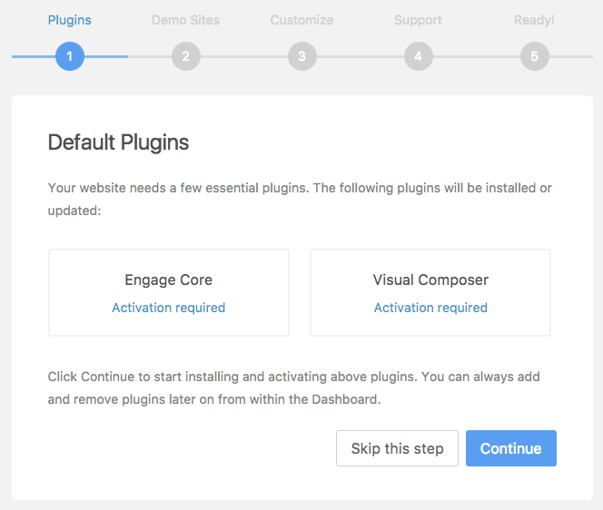
Click "Continue" and the wizard will start installing and activating plugins for you. After it's done, it will automatically go to the next step.
-
The "Demo Sites" step will provide you brief details about importing pre-built demo sites. Click "Continue" to proceed.
-
Next "Customize" step shows details about the Theme Options panel where you can fully customize your website. Click "Continue" to proceed.
-
The "Support" tab provides details about our support policy. Click "Continue" to proceed.
-
On the final step you will see a success message and two buttons: "Import Demo Sites" and "Theme Dashboard". The first one links to the theme's Demo Sites library where you will be able to import one of the pre-built demo sites. The second one will lead you to the theme dashboard. Choose one you prefer.

NOTE: You may always re-run the Setup Wizard by going to Appearance / Setup Wizard menu.
Theme Setup without the Wizard
If you cancalled the Setup Wizard you will still HAVE to install and activate theme required plugins: Engage Core and WPBakery Page Builder (former Visual Composer). You will see a small notice in your WordPress dashboard:

You may install and activate these two plugins two ways:
You may either go ahead and click the "Begin installing plugins" button and it will take you to the plugin installation menu:

Select both plugins and then change the "Bulk Actions" to "Install":

Now you may click "Apply" and the theme will start installing and activating plugins for you. When it's done, you will see a success message:

You may also install and activate theme required plugins by going to Engage / Plugins menu where you will see the Plugin library:

Just go ahead and click the "Install" button located next to required plugins name.
NOTE: Since WordPress 5.0, Gutenberg is now a default page/post content editor. If you would like to bring back the old editor, please install the "Classic Editor" plugin.
Theme Dashboard
Engage comes with a brilliant Theme Dashboard where you can find all theme related information and links in one place:
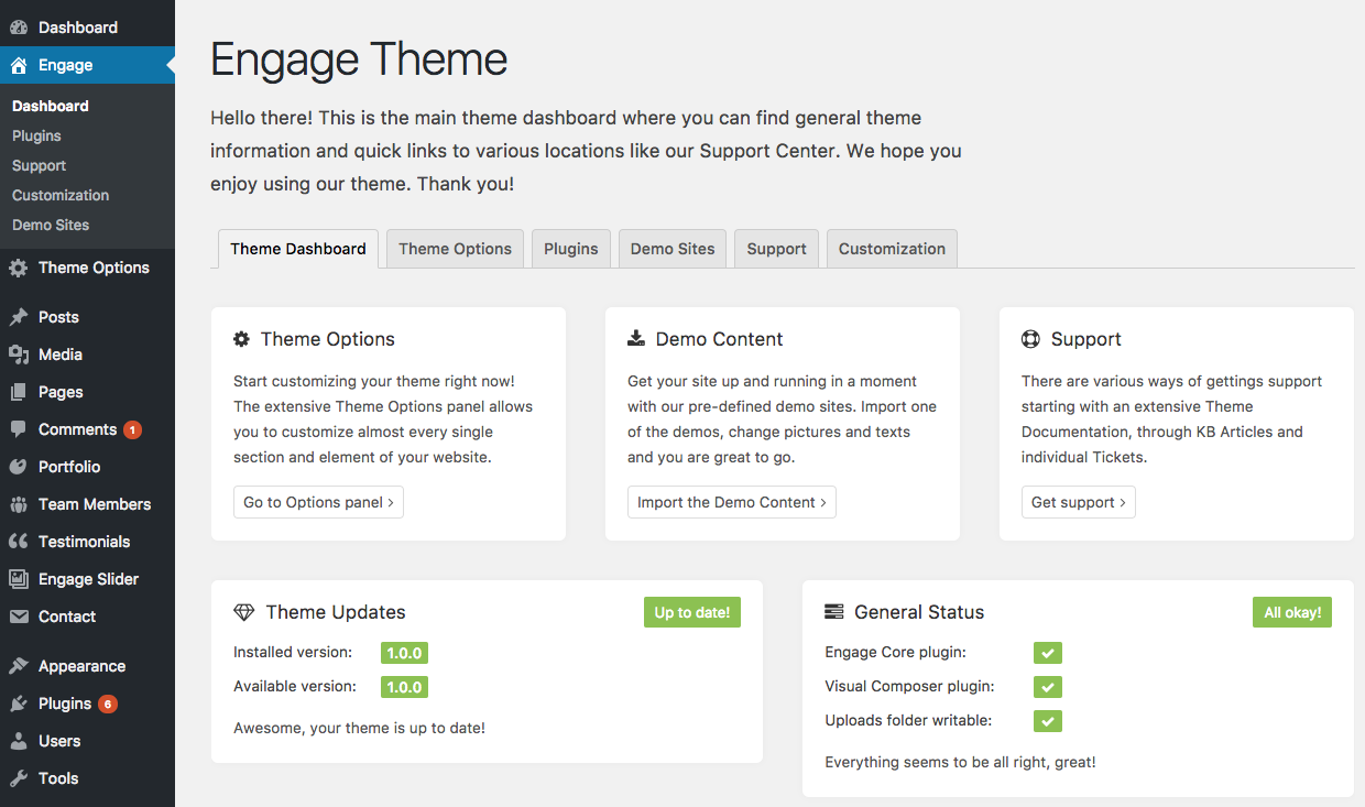
On the above screenshot you can see the main dashboard page. You may find some useful information there like your theme version (and if there are updates available), the general status (if you have all required plugins activated and if the uploads folder is writeable). You may also navigate to other tabs like "Support" where you can find support related details, "Customization" with links to our Premium Customization services or "Plugins" that will take you to the Plugin Manager.
Plugins
The theme comes with a brilliant Plugin Manager where you can manage theme related plugins:

If you want to install, activate or deactivate a plugin, it's the right place to visit. Just click on the button next to the plugin name and the plugin will be installed and activated in an instance.
If you decide to deactivate the plugin, the button will take you to the main WordPress "Plugins" menu. There you will need to find the specific plugin and click "deactivate".
NOTE: Since WordPress 5.0, Gutenberg is now a default page/post content editor. If you would like to bring back the old editor, please install the "Classic Editor" plugin.
Theme Options
Theme Options panel is a place where you can customize the theme to create a stunning website. Theme Options is available from the "Theme Options" menu item in your WordPress dashboard sidebar or the item of the same name in your WordPress admin bar.
You may learn more about Theme Options panel in the following video:
Overview
The following screenshot shows the General tab of the Options panel:

You can navigate to different sections of the Options panel using the sidebar navigation located on the left.
Saving changes
After you have made some changes in the panel, please don't forget to click the "Save Changes" button located both in the bottom and top section of the panel.
Restoring default settings
To restore default settings of some particular section you may click the "Reset Section" button that will bring back the default values for that particular section you have opened. If you want to reset the whole panel, go ahead and click the "Reset All" button.
NOTE: some options are "blank (empty)" by default and that means the theme will take the default value in that case. It's not an error.
Exporting / Importing settings
You may easily export your settings and then import them into another WordPress installation (or just for backup purposes). To do that, visit the "Import / Export" tab:

To export your options, you may either "Copy Data", download the data file or "Copy Export URL".
To import options you also have three different ways and you must choose pick the one that correlates with your export method. For example: If you downloaded the "Data File", you must click on the "Import from File" button.
Header
Header is one of the most important parts of any website. This section will provide you with all the information you need to know.
Header General
Header is the section of the theme that appears on the top of each of your pages and posts:

Your header might be missing the site navigation if you didn't import any demo sites. Please follow next subsections to learn how to fix that!
Creating Navigation
Your header requires a custom menu to be created for the navigation to work. WordPress comes with a brilliant "Menu" functionality. Please watch the video below (the navigation part of it) or continue reading to learn how to create a navigation menu:
To create a new menu, go to Appearance Menus, click on the "create a new menu" button, type in your menu name ("Site Navigation" on the example below) and click on the Create Menu menu button:

After the menu is created, you will presented with this view:

It is important that under the "Display location" you tick the "Primary Navigation" checkbox (as shown on the screenshot above) so the theme knows that you want this particular menu to be displayed as the main website navigation. You may go ahead and "Save Menu" after you do that.
Adding new menu items
You may add new items to your menu within the sidebar located on the left on the screenshot above (with the "Pages" heading) - of course you need to create some Pages or Posts first (for that visit the Creating Pages section). There you may tick pages or posts you want to add to your menu and after you click on the "Add to Menu" button, they will be moved to the area on the right:

After you're done adding your menu items go ahead and click the "Save Menu" button. From now on, that particular menu will be shown in your website header as your main website navigation. Cool!
Header Styling
By default, you're provided with a default, white header (unless you imported a demo site or just demo theme options). To customize your header go to Theme Options / Header menu and you will be presented with this view:

From here you may change all header related settings like changing the header position, style, make it not sticky, change the skin and so much more. Each option is well described so you won't get lost.
As you can see, there is a submenu under the "Header" menu in the Theme Options navigation sidebar on the left (starting with Header General, Top Bar, Dropdown Menu, Mobile Menu). Those will take you to options related to those specific header parts. Everything is well organised.
Individual Header Styling
Engage allows you to make some header changes individually for each of your pages, blog posts and portfolio posts. Just edit your particular page/post, scroll down to the "Page Settings" metabox and click to the "Header" tab:

Each option is well described so you shouldn't have any troubles there. For example, to have a transparent header on that particular page, just select the "Transaprent" Header Skin and you're good to go! The "Default" option means that the this page will have the global header styling options set in the Theme Options panel.
Top Bar
Top Bar is an extra, optional section displayed above the main header section. You may see an example on the Construction demo:

To enable the Top Bar section, go to Theme Options / Header / Top Bar menu and enable the "Top Bar" switch so it looks like above:
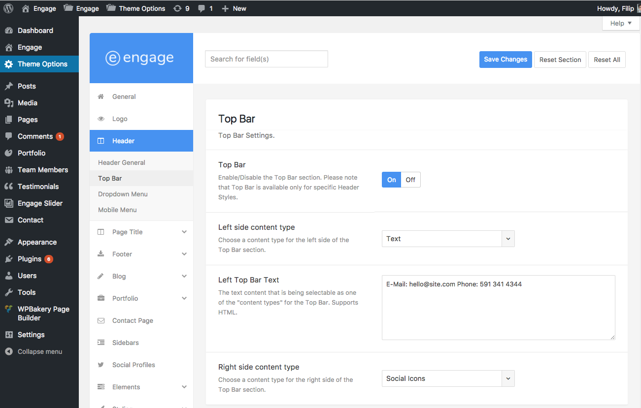
From there you may also choose the type of the content displayed on the left and right side of your Top Bar section. By default it is text on the left and Social Icons on the right. To create Social Icons, please visit the "Social Profiles" menu of the Theme Options panel.
To customize your Top Bar section please scroll a bit down and you will see the "Top Bar Styling" section.
Creating dropdown menus
Creating a dropdown menu is truly easy. Just go to Appearance / Menus, edit your main website navigation (if you haven't created one then please read the section above) and add new items you want to be a part of the dropdown menu. After they are added to your menu, you may easily drag them as on the screenshot below and push a little bit right and drop them there so they look just like above:

That's basically it! Just save your menu and you're good to go. If you need a 2nd level dropdown menu then you may just push the item a bit further to the right and done!
To customize your dropdown menus, go to Theme Options / Header / Dropdown Menus and change almost any styling aspect of your dropdown menus. Have fun!
Creating mega menus
When you learn how to create dropdown menus following the tutorial above, creating a mega menu will not be an problem at all. Just go to Appearance / Menus, edit your site navigation menu and arrange your menu items as shown below:

It's a regular, multilevel dropdown menu (with 4 child items, each having additional 2 subchild menu items). If you arrange your menu items like that without any further action, a regular multilevel dropdown menu will be created - and it's going to work. But to create a mega menu just edit the first, main menu item that contains the child elements and tick the "Mega Menu" checkbox. Save the menu and it's done!
Page Title
Page Title is a section displayed below the Header on your pages and posts. It holds the page title, breadcrumbs and post meta section if it's a blog post.
General Information
This is a default Page Title section:

It contains the page title and the breadcrumbs. Below sections will teach you everything you need to know about the page title section.
Disabling Page Title
To disable the Page Title area on a particular page for various reasons (maybe you built some super cool title using WPBakery Page Builder (former Visual Composer) or use a Hero Section or Revolution Slider there) edit your page, scroll down to "Page Settings" metabox, click on the "Page Title Area" tab and switch the value to "Disable" - see screenshot below:

Just save your page/post and you're all set!
To globally disable a Page Title, go to Theme Options / Page Title menu and switch the "Page Title" option to "Off".
Global Page Title Styling
To change the looks of your Page Title area on a global scale (to affect all your pages and posts), go to Theme Options / Page Title tab.

Each option is well described so you shouldn't have any troubles with each one.
Page Title Background
In this menu, you may scroll down to the "Page Title Background" section where may change the page title background color or set it to be an image. These changes are global.

Page Title with Background
Further down you may see a section called "Page Title with Background". These options apply only to your pages & posts that have a customized Page Title area locally - using the Page Settings metabox (see the section below Individual Styling). This section allows you to keep your default Page Title area very simple but on those pages where you want to have a background image or gradient, you might want to style differently - with a bolder title, other font color and so on.
Individual Page Title Styling
To individually style a Page Title area on a particular page or post, just scroll down to the "Page Settings" metabox while you're editing that page/post and click on the "Page Title Area" tab:

From here you may change many aspects of the page title area like using a custom title text, adding a page subtitle, changing the background image, color, height and so much more!
NOTE: if you set a background color or an image, your page title might change a bit. It's going to be a bit bigger and by default have white texts. You may adjust that behaviour in Theme Options / Page Title menu in the "Page Title with Background" section.
Breadcrumbs
Breadcrumbs section is a little navigation displayed in the Page Title area.
To disable it on a particular page, edit that page/post, scroll down to Page Settings metabox, click on the Page Title Area tab and set the "Breadcrumbs" option to "No".
To globally disable breadcrumbs area, go to Theme Options / Page Title / Breadcrumbs tab and set the Breadcrumbs option to "Disable"
Footer
This section covers all information required for you start with your website's footer.
Footer General
Footer is the area located at the very bottom of your website. If you haven't imported any demo site yet then you will be presented with this view:

As you may see on the screenshot above, footer area consists of two sections:
- Footer Widgets Area - this is an area where you may insert as many widgets as you need with various type of content.
- Footer Bottom Bar - a classic, bottom footer with your copyright text and social icons.
Footer Widgets Area
Footer Widgets Area is by default not visible (if you haven't imported any demo sites). In order to show it, you need to add some widgets. To do that, go to Appearance / Widgets menu and drag some widgets into Footer 1-4 widget areas:

Changing the number of columns
To change the number of widget columns, just visit the Theme Options / Footer menu and choose your desired layout in the "Footer Widgets Layout" dropdown menu:

Styling the Footer Widgets Area
You may fully customize your Footer Widgets Area by going to Theme Options / Footer / Footer Styling menu and scroll to "Footer Widgets Area" section. Each option is well described so you shouldn't have any problems with the styling process:
Footer Bottom Bar
Footer Bottom Bar is the very last section of your website. It contains the copyright text and your social profiles icon.
To change the copyright text, please go to Theme Options / Footer menu and add your text in the "Copyright Text" textarea:
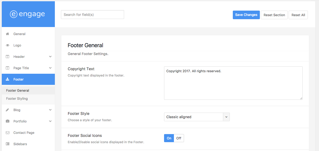
You may also change the footer style there by selecting it from the "Footer Style" dropdown menu.
Adding Social Icons
By default (if you haven't imported a demo site), you won't see any social profiles in your footer. To add them, please go to Theme Options / Social Profiles, click on specific icons and fill them out with your social website URLs:

Styling the Footer Bottom Bar
To customize looks of your Bottom Bar, go to Theme Options / Footer / Footer Styling tab and scroll down to "Footer Bottom Bar" section. Each option is well described so you shouldn't have any troubles.
Creating Pages and Page Builder
In this section, you will learn how to create pages and content using the Engage theme.
We recommend that you watch the video below that will show you step-by-step how to create pages and use the page builder along with Engage Templates:
Creating a New Page
To begin, let's create a simple page. You may always add new pages by clicking "Pages / Add New" in your WordPress sidebar navigation or "New / Page" menu in your WordPress Admin Bar:

A view of an empty page looks like this:

Numbers on the screenshot represent main areas:
- 1Page Title - the page title. Required.
- 2Page Builder switch - the "Backend Editor" button allows you to enable the WPBakery Page Builder (former Visual Composer) page builder on this particular page. If you can't see it, make sure that you have the "WPBakery Page Builder" (former Visual Composer) plugin enabled (Engage Dashboard / Plugins menu).
- 3Page Content - This is a place for the page content. You may either add a regular text content with the default WordPress editor or switch to the Page Builder using the blue "Backend Editor" button.
- 4Page Settings metabox - this is a place where you may control your page layout, choose a sidebar area, style the header, disable or customise the Page Title area and much more.
- 5Publish/Update - this button allows you to publish and update your pages and posts.
- 6Page Attributes - this a default WordPress page metabox where you may set a parent page, template and menu order.
- 7Featured Image - featured images are not really needed for Pages so you may always skip that part unless it's need by one of your plugins.
Using the Page Builder
To activate the WPBakery Page Builder (former Visual Composer) page builder on your page or post, click the blue "Backend Editor" button that you may find under the page title:

When you do it, your blank page will look like this:

Numbers on the screenshot represent main areas:
- 1Classic Mode - you may disable the Page Builder on this page by clicking on this button.
- 2Frontend Editor - it is not recommended to use the frontend editor since it may be buggy with exclusive Engage templates. It is recommended to use the default, backend editor only.
- 3Add Element - you may add a new element/component using these buttons.
- 4Add Template - add a new template to this page. Learn more.
- 5Fullscreen - toggle the fullscreen page builder editor view.
- 6Custom CSS - when you click this button, a CSS code editor will appear where you may add any CSS code that will affect only this particular page/post.
- 7Add Text Block - you may immediately add a text block by clicking on this button.
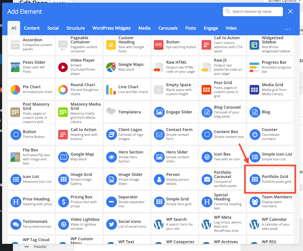
After you click "Add Element" button, the components library will appear where you may choose an element that you want:

As you can see, you may easily filter all elements or even make a quick search using the search form located in the upper right part of the popup window. All Engage theme exclusive elements are marked with white icons inside a blue circle. You may also easily find them by clicking on the "Engage" tab above.
Whenever you add a new element, a settings window for that particular component will appear. The one below is for the "Text Block":

When you're done adjusting settings, click "Save changes" to save the element. You will see that it was added directly to the page builder content:

As you can see, the "Text Block" is wrapped inside a bigger element - a row. Rows are there to easily arrange elements in rows and columns. On the above screenshot we marked the row options:
- 1Drag Element - whenever you see this "drag & drop" icon, you may indeed drag it and move the whole row/element and move it anywhere else.
- 2Columns - to change the number of columns in a particular row, just hover over this icon and you will see available options.
- 3Add column - quickly add a new column to a particular row.
- 4Toggle view - easily "hide" the row's content.
- 5Row Settings - click this button to open the row settings window where you can adjust paddings, margins, background images, colors and much more!
- 6Duplicate Row - easily duplicate an entire row along with the content inside it.
- 7Delete Row - delete the entire row including the content.
When you hover over a particular element inside a row/column, you will also see few controls:
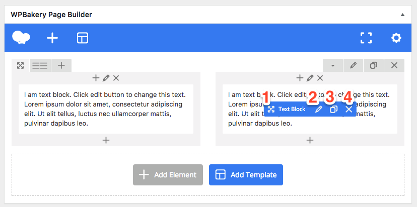
As you may see, control icons are very similar to the one in the row:
- 1Drag Element - easily move the element by dragging this icon and dropping anywhere else.
- 2Edit Settings - click this icon to adjust the element settings.
- 3Duplicate Element - easily duplicate the element with all settings. The duplicated element will be placed right below the original one.
- 4Delete Element - delete the element from your page content.
Knowing all the above, you may now easily build pages with any content you want - arranged in any column layout.
Page Settings
Besides from the Page Builder and regular Content Editor, Engage brings you a brilliant "Page Settings" metabox where you may easily change many aspects of your pages/posts from one place - without a need to jump around multiple metabox windows:
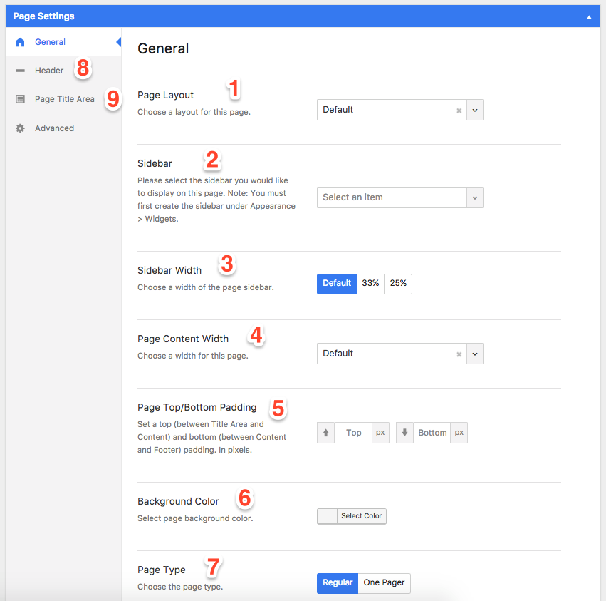
- 1Page Layout - change the layout of the page: fullwidth, sidebar right, sidebar left or two sidebars. Default means that it uses a default layout set in Theme Options / General tab.
- 2Sidebar - if you have a sidebar layout set for this page, you will be able to choose a sidebar location (you may edit sidebar areas Appearance / Widgets).
- 3Sidebar Width - choose a sidebar width.
- 4Page Content Width - decide if you want a regular content width or you want it to be stretched all across the browser window.
- 5Page Top/Bottom Padding - change the top and bottom padding (space) for this particular page.
- 6Background Color - change the background color for the page.
- 7Page Type - you may set the page type to be "One Pager". You can find more information in the other part of the documentation
Engage Templates
One of the greatest theme features are "Engage Templates". They give you access to over 120 pre-built website sections that will allow you to create complete pages in a matter of few mouse clicks. Please check the instructional video below to learn how to use them:
Using Engage Templates
You may use Engage Templates on any page/post that is supported by the WPBakery Page Builder (former Visual Composer) Page Builder (the WPBakery Page Builder plugin must be installed and activated).
To begin, just activate the Page Builder on your page/post by clicking on the blue "Backend Editor" button:
When you activate it, you should see a blank page builder page as in the following screenshot:

You may add a new template by clicking either a template icon in the upper left corner (marked as 1 on the screenshot above) or by clicking on the "Add Template" button (marked as 2).
If you already have a content on your page, the layout of the page builder will change a bit but it's very similar:

After clicking any of them, you will be presented with the Templates library popup window:

We marked the major points on the screenshot above:
- 1Templates Categories - you may easily filter all sections by clicking a desired category name.
- 2Template Details - a little description of the particular template.
- 3Load Template - click this button to load the template directly to the page you're editing.
- 4Bigger Preview - when you hover your mouse over a thumbnail, a magnifier icon will appear. When you click it, a bigger preview of a specific template will be displayed.
- 5My Templates - this is a section where you can create and preview your own templates created with WPBakery Page Builder / Templatera.
- 6Template library - this is an officiall WPBakery Page Builder (former Visual Composer) template library - accessible only for premium VC plugin users.
- 7Close Window - close the Engage Templates library window.
Note: images in some templates might differ from ones presented in the thumbnail. They're all hosted on our server and we might be changing them over time so you can get the highest quality images on your website.
When you're decided with a template, just click the "Load Template" button and it will be imported directly to a page/post you're editing, like that:

You may import as many templates as you want.
Note: as you may see on the screenshot above, the image thumbnail has not been automatically generated. That's because the image is hosted on your server (we don't want you to get bloated with new images every time you load a template) and WPBakery Page Builder does not generate thumbnails for external images. This way the process of importing templates is also faster.
Portfolio
Portfolio is a brilliant theme feature that allows you to easily present your awesome work and projects. You may either import one of the Demo Sites (like Portfolio Classic or Elegant) for a quick start or just continue reading this section to learn how to do it from scratch.
We also prepared a narrated video presentation that will teach you step-by-step how to create portfolio posts and pages:
Portfolio Posts
At the beginning, we're going to show you how to create single portfolio posts. Each of them can represent your single project/work. You may create new posts by going to Portfolio / Add New tab in the WordPress side navigation or clicking the "New / Portfolio" link in your WordPress admin bar:

A new portfolio post creation page looks like the following:

Numbers on the screenshot represent main sections:
- 1Post Title - a post title like in any other post type (blog, page). Required.
- 2Post Content - as in any other post/page, you may use either a regular WP editor or the Page Builder to add content. By default, the portfolio post layout is: media on the left and content (with Project Details) as a sidebar on the right. In that layout, it's not recommended to use the page builder. You will learn more in a bit.
- 3Portfolio Post Settings - portfolio posts come with a dedicated Portfolio Post tab in the Page Settings metabox. You will find there useful options to fully configure your portfolio post layout/content as you wish. You can learn more here.
- 4Post Categories - just as in blog posts, you may easily categorise your portfolio posts. Categories are also used in "Filtering Menu" within portfolio grids. They're useful if you want to display only certain posts in various locations (Portfolio Grid and Portfolio Carousel components allow you to display posts only from specific categories).
- 5Post Skills - portfolio posts allow to add Skills too. They're displayed in the "Project Details" field, under the post content and may be used to additionally categorise your projects by skills used for the creation: HTML, CSS, Photoshop, Illustrator etc. They're optional.
- 6Featured Image - this is your post thumbnail. It's required if you want to display your post in a grid/carousel.
When you're done adding content and configuring your post, simply publish it like you'd save any other post or page!
"Portfolio Post" settings metabox
When you create a new portfolio post, in the Page Settings metabox you will find a new tab: "Portfolio Post". Here, you may configure your portfolio post content, layout and much more:

Whenever you see a "Default" option being set, it means that it retrieves it from Theme Options / Single Posts where you may define some options globally - for all posts at once.
Below, we described some of the most important fields:
- Project Information - this is an optional textarea field for your portfolio post description text. If you decide to use it, it will automatically replace the content from the regular WordPress editor (or page builder) while the latter will be displayed at the very bottom of your portfolio post.
- Post Layout - layout of your portfolio post content:
- Side - the post media (featured image or other) is displayed on the left, while the post content is displayed in a sidebar on the right.
- Fullwidth - the post media is displayed at the top of the post while the post content with project details are below.
- Show Project Details - decide if you want to display the "Project Details" section (it contains data like Categories, Skills, Project Link, Client etc that you may configure below) or not.
- Show About Project Heading - enable or disable the "About Project" heading displayed above the post content.
- Show Media - enable or disable the post media (featured image or any other media that you may add with options described below).
- Video Media - add a video to your portfolio post. It can either be a self hosted video or external one from YouTube, Vimeo or other sites. Video is always displayed above other medias (images).
- Image Gallery - easily create an image gallery using this native image gallery functionality
- Gallery Type - choose the type of a gallery.
- Project Details Heading - if you decide to display the "Project Details" section, you may easily disable the section's heading.
- Display Project Categories - enable or disable portfolio categories part in the "Project Details" section.
- Display Project Skills - enable or disable Skills to be displayed in the "Project Details" section
- Project Client - add a client to this particular project. It will be displayed in the "Project Details" area. Optional.
- Extra Field Label - you may add other field to your "Project Details" area. Just type the label here and a new textfield will appear where you may add the value.
- Post Navigation - enable or disable the portfolio post navigation.
- Parent Portfolio Page - a parent portfolio page is displayed in the Post Navigation as a little "grid" icon that is supposed to take the visitor to the main portfolio page. You may either use the "Default" value to use the portfolio page set in your Theme Options / Portfolio tab or pick a custom page for this particular post.
- Thumbnail Aspect Ratio - if you use a "Mosaic" layout in your Portfolio Grid, you may configure the particular post thumbnail size here:
- Tall - the thumbnail will take 2 regular thumbnail places vertically (2x1).
- Wide - the thumbnail will take 2 regular thumbnail places horizontally (1x2).
- Big - the thumbnail will take 4 regular thumbnail places (2x2).
Portfolio Page/Grid
When you're done creating your portfolio posts, it's time to display them in a nice grid on your website. There are two ways to create a portfolio page:
- Page Builder - you may create as many pages with a portfolio grid as you wish with a "Portfolio Grid" component available in the WPBakery Page Builder. Learn more.
- Portfolio Page Template - the theme comes with a "Portfolio Page" template that you may easily assign to any page. Learn more.
Portfolio Page with Page Builder
You may create a portfolio page using a "Portfolio Grid" component available as one of the elements in the WPBakery Page Builder (former Visual Composer). Just create a new page, enable the Page Builder (click on the blue Backend Editor button):
Click Add Element to add a new element:

and choose the "Portfolio Grid" component:
The element has just been added to your page builder content. Whenever you add a new element, a settings page will appear. For the "Portfolio Grid" it looks like this:

Wherever you see Theme Defaults value, it means that it's being pulled from the global settings in Theme Options Portfolio tab.
When you're done setting up the portfolio grid, just click Save changes and publish/save your page. When you preview it, you should see your portfolio posts being displayed in a nice grid!
Portfolio Page with Template
You may also create a portfolio page without the WPBakery Page Builder (former Visual Composer). Just create a new page and set the Page Template to "Portfolio Page":

And... that's basically it. You may save and preview your page. If you decide to create your portfolio page this way, keep in mind that it's going to display portfolio posts from all categories. To change the style of the that particular grid, just visit the Theme Options Portfolio tab.
Contact Page & Google Maps
To learn how to create a contact page, configure the contact form and setup Google Maps, please watch the following video:
Contact Form Setup
Engage comes with an awesome, pre-built simple contact form. It's available for you with either a contact page template or a "Contact Form" element in the WPBakery Page Builder (former Visual Composer). Before you can use it, you need to perform a little setup. Trust us - it's super simple!
Just visit Theme Options Contact Page menu and insert your e-mail address to :

And... that's it! Your contact form is ready to use!
Google Maps Setup
Engage comes with brilliant Google Map components with various different styles that you may easily choose from a dropdown menu. Before you can start using our Google Map element (that is also a part of the Contact Page template), you need to configure the Google Maps API key in the Theme Options Contact Page tab:

In the field description, you will find a link to our Support Center article (we host it online so it can be constantly updated to latest Google changes) where we described step-by-step how to obtain your own API key. You may find the article here.
When you have the API key, just go ahead and paste it into the "Google Maps API Key" field highlighted on the screenshot above, save the options panel and done! You may now use the Google Maps component.
Create Contact Page
With Engage, you may build a contact page two ways: by using a Contact Page template or by building one with the page builder - or just import a pre-built contact section with Engage Templates. We will show you each method below.
Contact Page Template
Engage comes with a fantastic, ready to use Contact Page template that may save you a lot of time creating a simple contact page. To begin, create a new page, give it a title, add some simple content and set the Template to "Contact Page":

After you save the page, you will a similar layout to the one presented on the screenshot below (if you have configured your Google Maps following the tutorial above):

- 1Google Map - by default, the Google Map is being displayed above the form and page content. You can disable it completely, change the height, change the position in Theme Option Contact Page.
- 2Contact Form - by default, the contact form is being displayed in a 66% width column on the left. You may change it's width (to 50% or fullwidth) in Theme Option Contact Page.
- 3Page Content - this is a place where you page content is being displayed. It can either be regular text or a WPBakery Page Builder (former Visual Composer) content.
Contact Page with Page Builder
If you want to have much more customization options for your contact page, you may easily build it with the Page Builder. Just create a new page (and make sure that it uses a Default Template instead of the contact one) and activate the Page Builder (with the blue Backend Editor button displayed below the title).
With the page builder, you may add contact related blocks like: Contact Form, Google Map or Lists. You may also save yourself a lot of time and just import a predefined Contact template using Engage Templates. Just click "Add Template" button (if you don't know how to use Engage Templates then please read this article) and click "Contact" filter menu on the bottom left to preview only contact related sections:

For the purpose of this tutorial, we're going to import the "Contact Form + Details" section and "Map Fullwidth Light". After you import them, your page builder should look like this:

You may of course re-arrange components as you wish or add as many other templates and components as you want! The layout presented above is going to look like the following on a live page:

Blog
To learn how to create a blog index page and blog posts of each format, please watch the video below:
Theme Hooks
For a full list of theme hooks, please visit the article on our Support Site: Link
Theme & Plugin Updates
For a full theme and plugins update guide, please visit the article on our Support Site: Link